Documentation/Appearance and layout
Guide 11Appearance and layout
Make the popup comfortable to read and convenient to use.
Choose a visual style
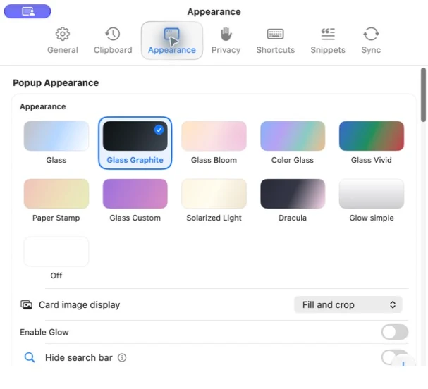
Open Settings → Appearance and choose a popup theme. The available styles include Glass variants, Paper Stamp, Solarized Light, Dracula, Glow simple and an off option in the current app.
Native glass effects can look different across macOS versions, wallpapers and accessibility settings. Choose based on legibility in the workspace you actually use.
List or cards
Use the popup’s available layout controls to select the browsing style you prefer. A list keeps more items in view; cards give visual content more room. Image fitting settings determine whether a card fills its frame by cropping or keeps the whole image visible.
Changing image fitting changes presentation; it does not rewrite the original image.
Keep useful controls visible
Appearance settings include search visibility, content-type filters, the Snippets tab, folders in Important, contextual hints and several popup controls. If a feature seems missing, check its visibility setting before assuming its data is gone.
Leave Search and content-type filters visible while you are learning the app.
Custom artwork and personal marks
Where offered by your selected theme, use the custom background or personal mark controls to choose artwork. Use images you have permission to use, with enough contrast to keep clipboard text readable. Personal artwork is optional; the app remains useful with the built-in appearance.
Preview readability
Adjust preview text size using the configured actions. Check both short and long clips. If a title or button becomes difficult to read, try a calmer background or another theme before adding more visual effects.
Return to a familiar setup
Record the choices you prefer before experimenting. A per-setting reset restores that setting’s default; broader reset actions may affect several preferences. Read the button label and help text before using them.